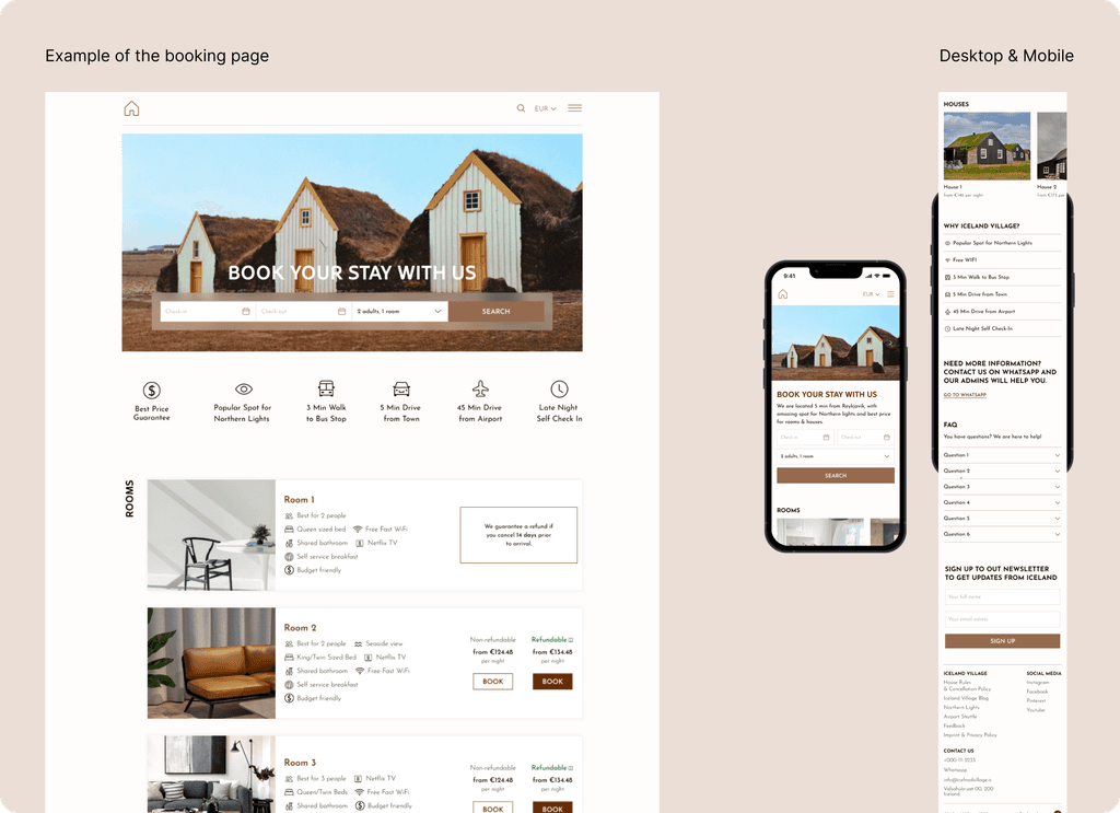
Iceland village is a hotel that rents out rooms and guest houses with breakfast services. Every year, Iceland village hosts around 2500 guests from different countries. Most bookings are made by travelers from the USA, Italy, Iceland, France, and Norway through popular services like Booking.com and Tripadvisor.
While Iceland village has its own website offering lower booking costs compared to third-party platforms, the company aims to encourage more bookings through its site to reduce fees paid to external platforms.
Task
Increase desktop and mobile website booking conversion to reduce dependence on third-party platforms.
My role
In addressing this task, I identified 5 key stages:
Discovery
At this stage, I studied the task from different angles to understand the underlying causes. It's essential to identify the business user, conduct competitor research, and analyze the existing solution through the lens of best market practices.
Define
Based on the insights gained, I formulated several hypotheses that could impact the business metric of interest – conversion rate. These hypotheses formed the basis for the subsequent stages.
Develop
I conducted a comprehensive redesign of the booking and payment scenario on the website, along with minor visual changes. When redesigning, it was important to create a clear and simple booking path regardless of the device.
Deliver
After completing the redesign, I handed over the prototypes to the development team, answered emerging questions, and participated in the review of the final result.
Discovery
One of the first steps I took was to hold meetings with key stakeholders. I always prepare for such meetings, immerse myself in the subject matter, to make them efficient.
During independent data collection, I determined the website's conversion rate – 0.8% (0.6% for desktop and 0.2% for mobile). When reviewing the booking flow, visual problems immediately became apparent – the visuals differed between desktop and mobile versions. I also noted a disrupted hierarchy, non-uniform design, and slow mobile site loading speeds.
Meetings
During the meeting with the owner, I received data on the mobile site conversion rate and information about the target audience. Interestingly, most travellers over 45 years old usually book a room 1-2 days before arrival, already being in Iceland. It also became clear during the discussion that mobile bookings are made through the support service via WhatsApp.
In the meeting with support staff, I learned that users often contacted them to find out about room availability for upcoming dates, asked what "refundable" and "non-refundable" mean, and requested help with booking due to payment issues.
User research
To solve the task, it was also important to understand the product's target audience. The support team and business owner helped with this, providing information about the age of travellers – 28 and above, couples, mainly from the USA, Italy, Iceland, France, and Norway, who want to book accommodation to see the Northern Lights and explore Iceland's other attractions. One of the site visit goals for them is to check room availability for specific dates and book for more than 3 days.
Desk research
Given the tight deadlines and lack of respondents, I decided that using desk research methods would be effective. Starting this stage, I thought about the following questions: Why can't users complete the booking process on the site? What causes the low conversion rate? What makes them contact support? And how can we compete with large services?
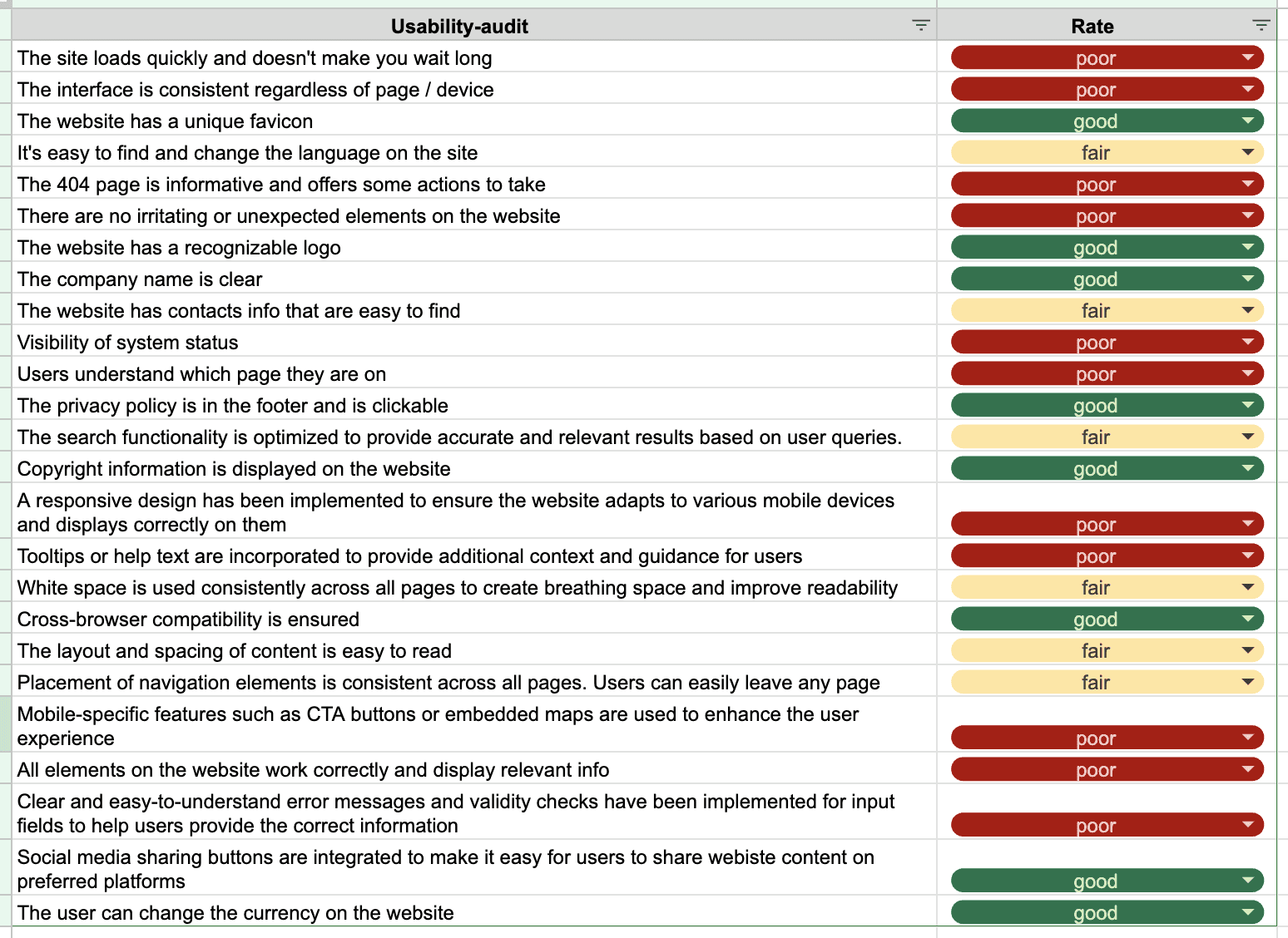
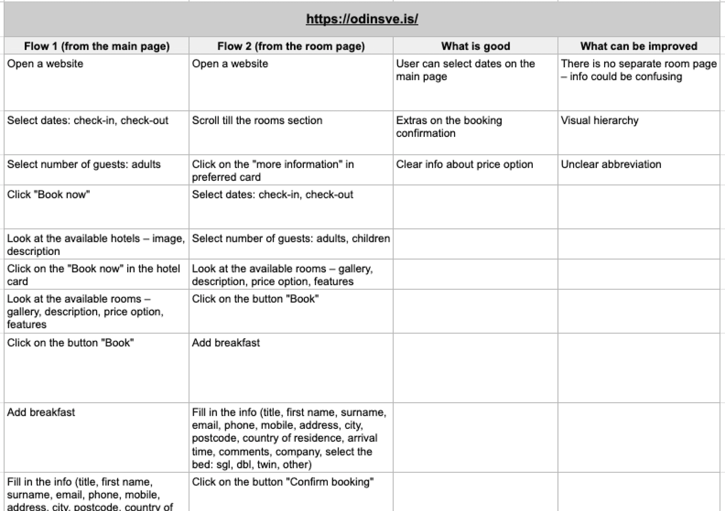
First, I decided to conduct a usability test. For this, I prepared a checklist based on 10 accessibility heuristics and proceeded to go through the booking scenario. You can familiarise yourself with the result in the image below.
UX conclusions
It's impossible to book a room/house from the dedicated page, users can only do this from the general booking page.
The site loads very slowly – 6.8 seconds until the first content appears, 12.8 seconds until full load.
The site behavior is not always obvious. For example, when entering new booking dates, a loading process is not displayed and there is no "search" button. The result updates automatically. Such an approach can lead to confusion, as it's not entirely clear what data was updated.
The design is not adaptive (for example, the desktop version is displayed on mobile devices).
Some interface elements and phrasings are not informative.
UI conclusions
The site predominantly has different visuals: different fonts, colors, shapes, buttons are found on the pages. This negatively affects trust in the resource.
The positioning of buttons, element sizes have different meanings.
The mobile version is characterised by chaotic design, elements overlap each other.
Competitor analysis
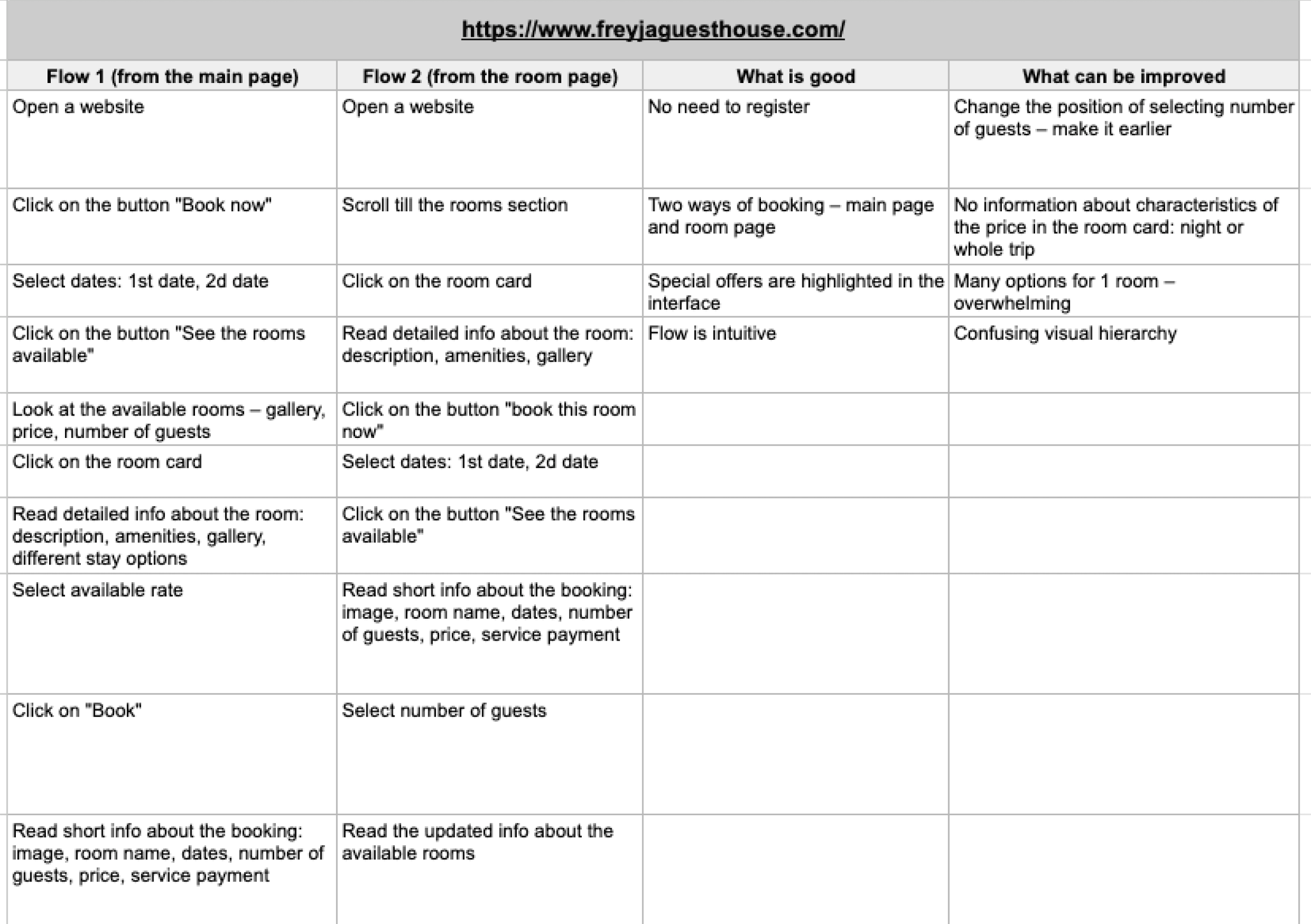
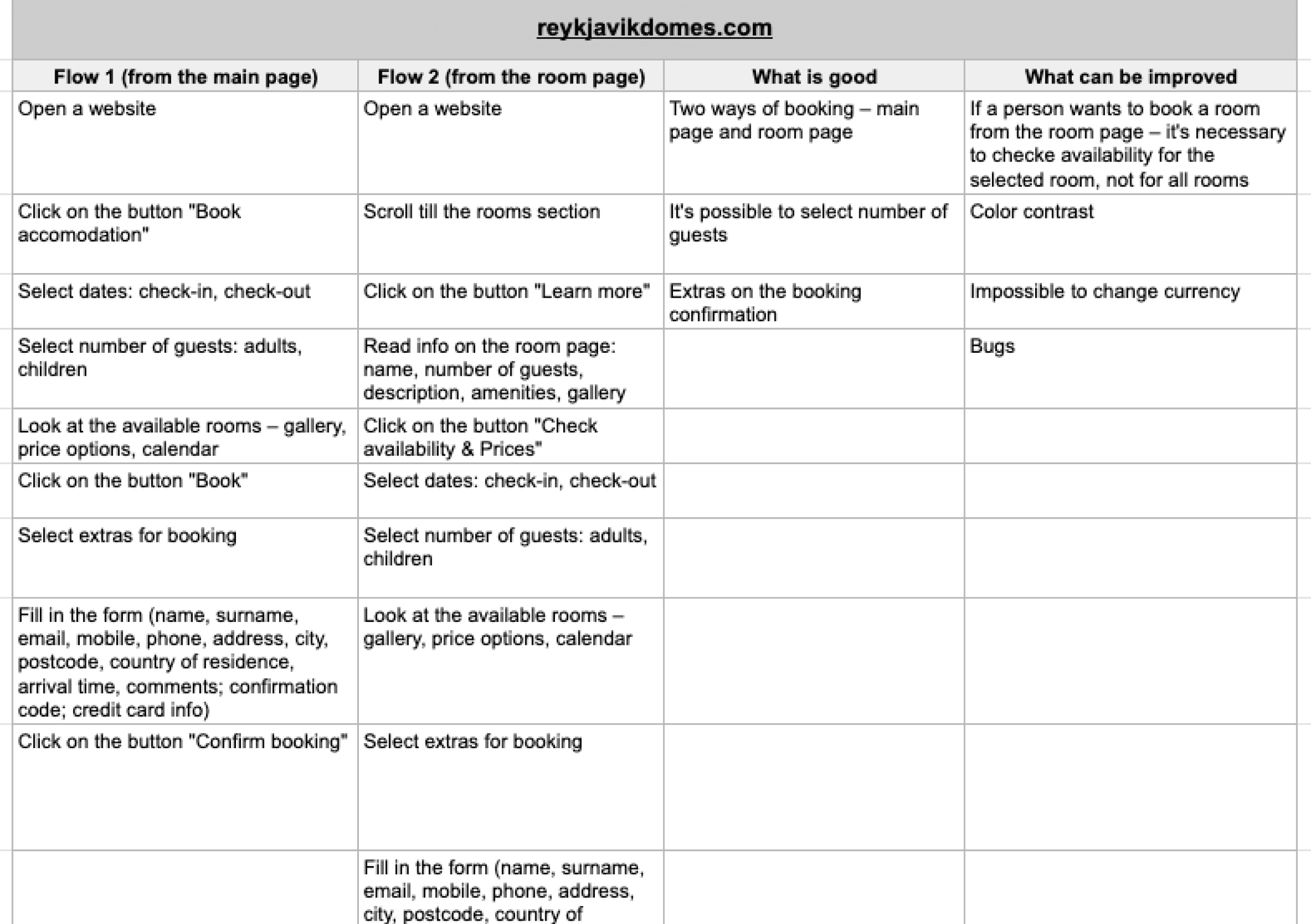
To get an idea of the competitors' interfaces and booking flows, I analysed three resources, noting their strengths and weaknesses. This exercise helped me understand what they implemented effectively and what we can learn from them.
I also studied three booking services, focusing on the search function and comparing card entities, room pages. This allowed me to identify common practices and generally assume user expectations.
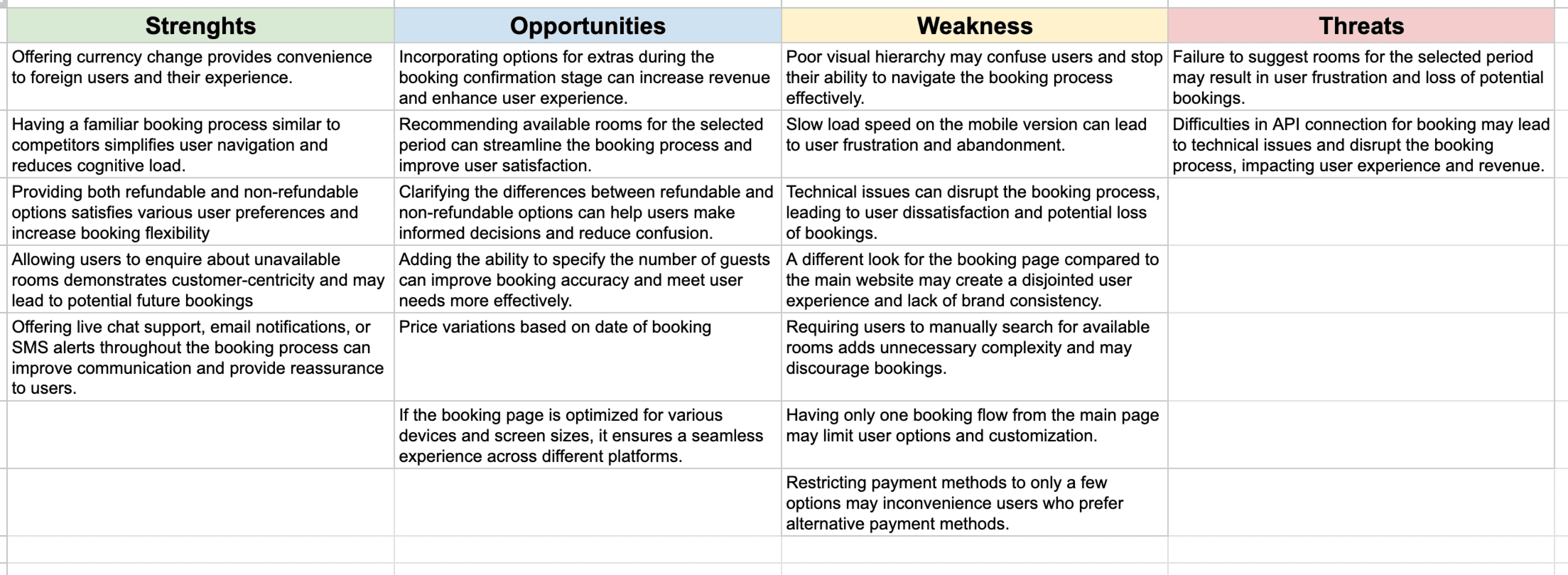
SWOT
Using this framework, I summarised all the qualitative data obtained at the previous stages, which created a good basis for generating hypotheses.
Define
Based on the research data, I formulated the following hypotheses and discussed them with the team:
#1
Different visuals on site pages lead to user confusion on the booking page, resulting in a high bounce rate (82%). Using a single visual language (colors, shapes, typography) on different site pages, particularly on the booking page, will reduce bounce rates by reducing user confusion and making the booking process more uniform.
#2
Creating a mobile site version will speed up content loading by 20% and reduce the user's waiting time.
#3
Adding information about the payment system in the form of a plaque will increase user trust in the resource and increase the likelihood of completing the booking scenario.
#4
Applying visual hierarchy principles will increase independent accommodation booking due to improved navigation, display of necessary booking information, and reduce the number of support requests via WhatsApp.
#5
Adding a "Search" button and displaying search results only after interacting with the button will make the search process more intuitive and understandable for the user.
#6
The lack of information about the differences in the "refundable" and "non-refundable" options creates confusion among users and increases the number of support requests for clarification. Adding clear and understandable differentiation between the "refundable" and "non-refundable" options will reduce the load on support and allow the user to independently choose a booking option.
#7
Providing the opportunity to book accommodation from the room/house page will be more convenient for the user, increasing the chances of successful booking due to fewer necessary transitions.
Develop
User flow
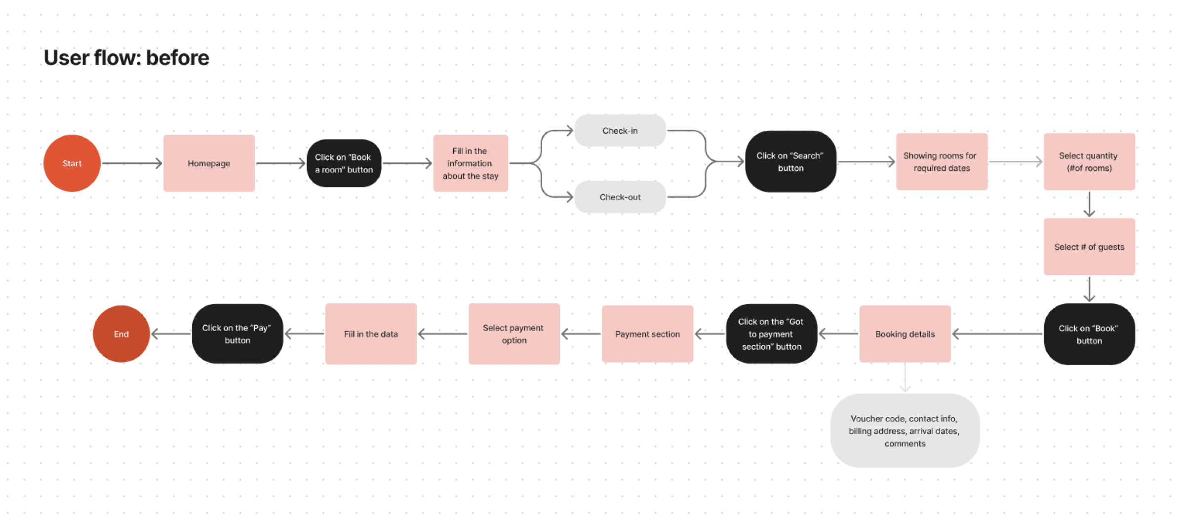
The next step was preparing booking scenarios. The "before" option is presented below. The main problems with this path are:
One possible option to book a room is only from the main booking page.
The selection of the number of rooms and guests is separate.
There is no differentiation between "refundable" and "non-refundable" options.
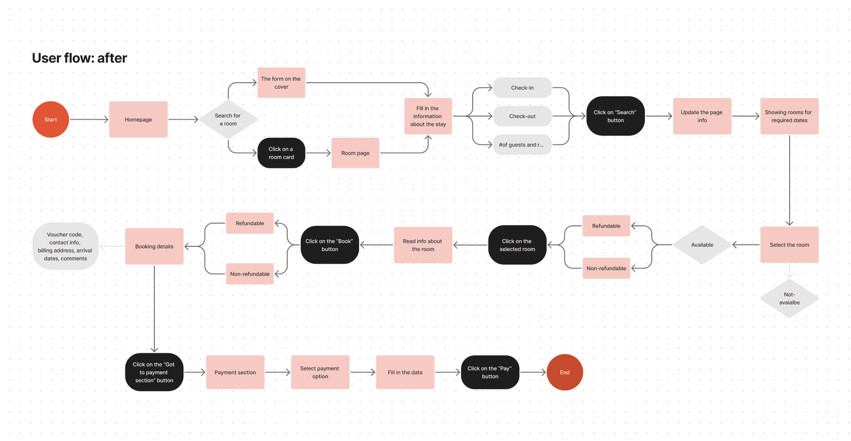
The new flow includes the opportunity to book accommodation from the room/house page, a modified search form, and clear differentiation between different booking options.
High-fidelity screens
A coordinated brand book was available in the materials, so I immediately started preparing visual options using the recommended styles, typography, and available components.
According to the agreement, I cannot show the final design. But it can be shown when changing the text, color, phrasings.
What have been changed?
In general
The booking page visual design.
The hierarchy of cards and the placement of structural elements on the pages.
Button size and states, as well as field states
Use of uniform visual elements (icons, colors, typography) on all site pages.
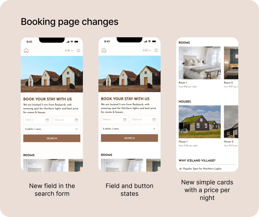
Booking page
A new field has been added to the search form to specify the #of guests and rooms.
States have been implemented for text fields and buttons, explaining to the user what information needs to be entered to start the search.
A gallery has been prepared to demonstrate the rooms and houses for booking.
Information about the price per night has been added to the accommodation cards.
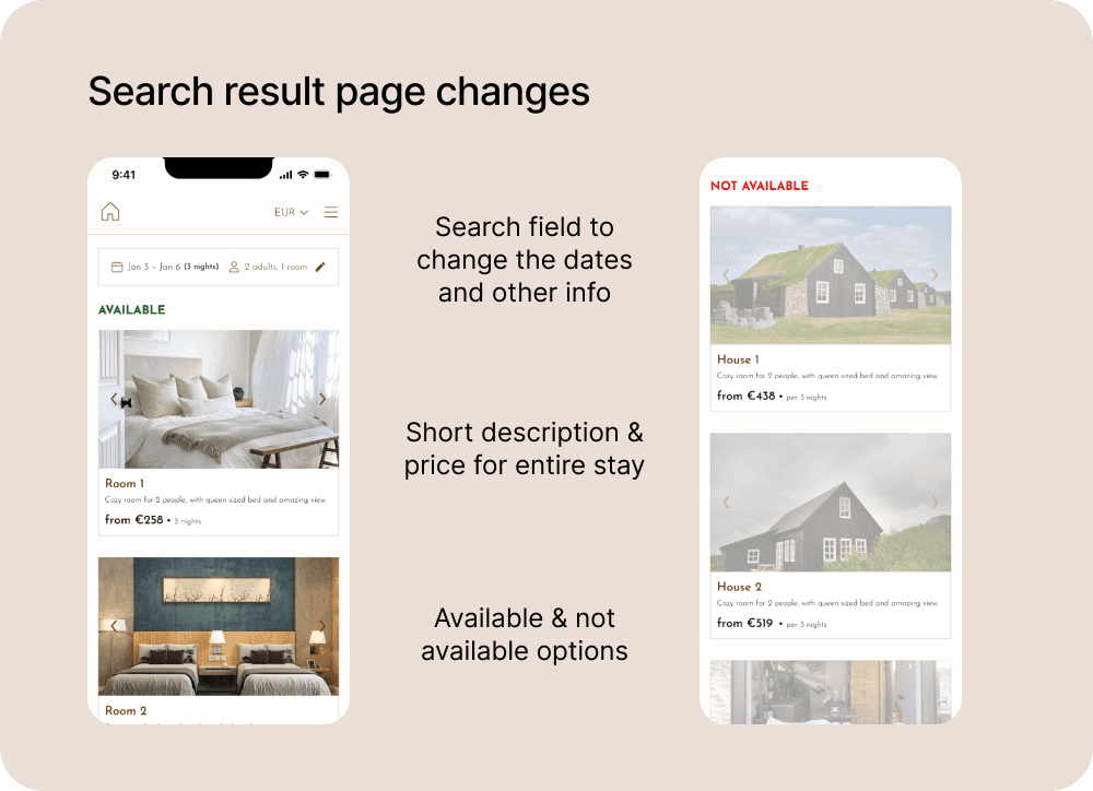
Search results
A short description has been added to the cards with accommodation options.
Information about the cost for the booking period has been added.
Search results are divided into "available" and "not available".
A search form has been added, so the user has the opportunity to change dates, number of guests and rooms.
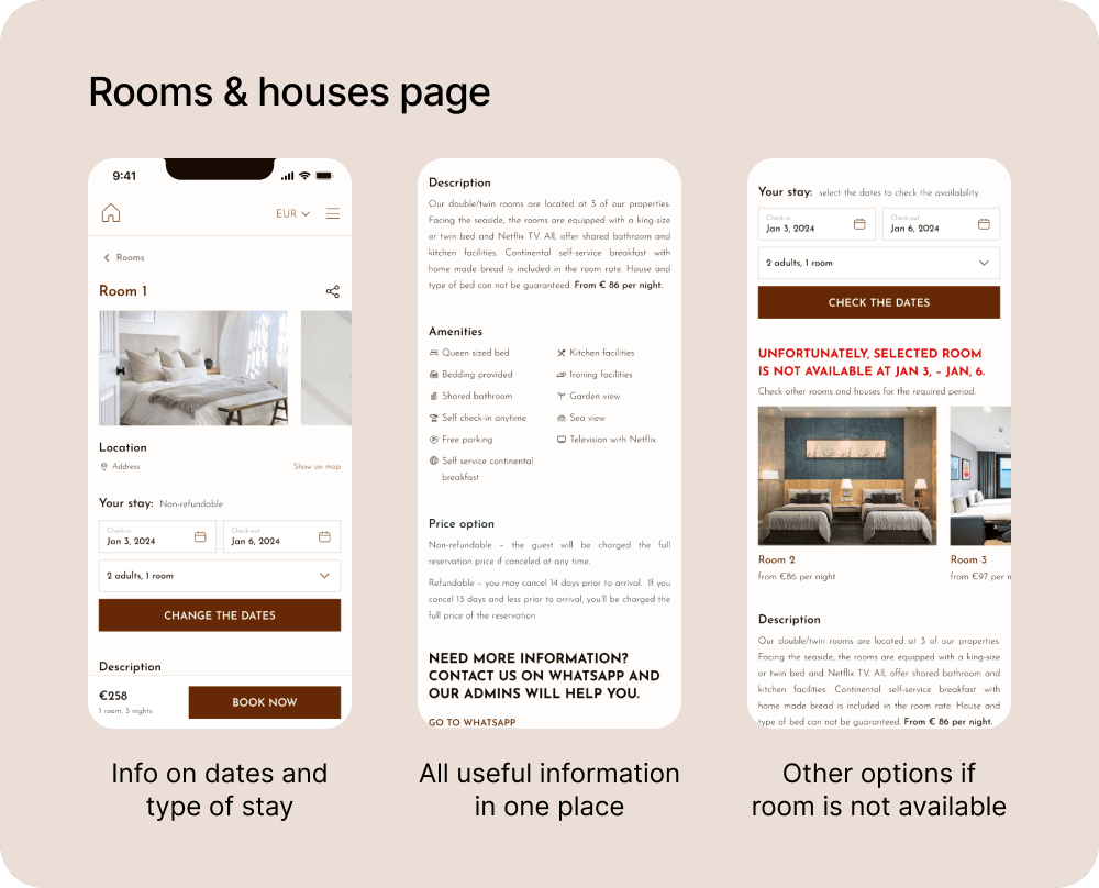
Room & house page
A search form has been added – for users who did not fill in information on the general booking page.
Three sections: description, amenities, and price have been added to each room and house page.
In the mobile site version, a plaque with information about booking dates, duration of booking and the "Book" button has been added. The element is fixed at the bottom of the screen.
In case of no available room/house for the desired period, information about this has been added and alternative available options are offered.
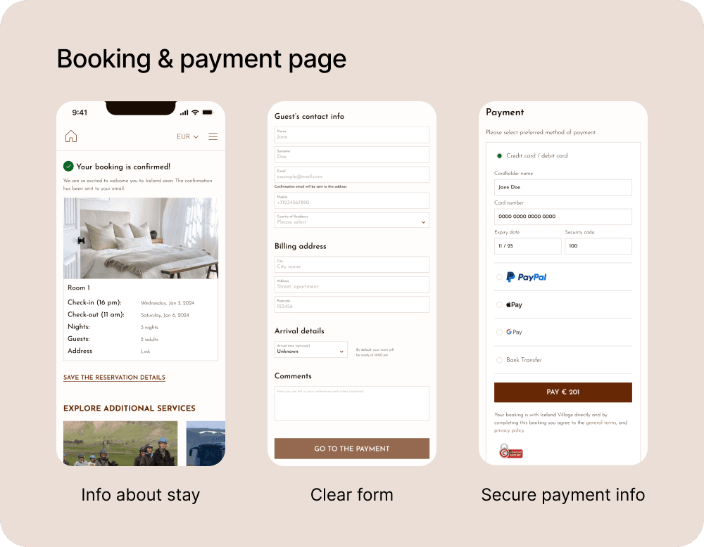
Booking & payment
Information about booking has been added.
Information about what needs to be filled in has been structured.
Information about the security of payment on the site has been added.
Apple Pay and Google Pay payment options have been added.
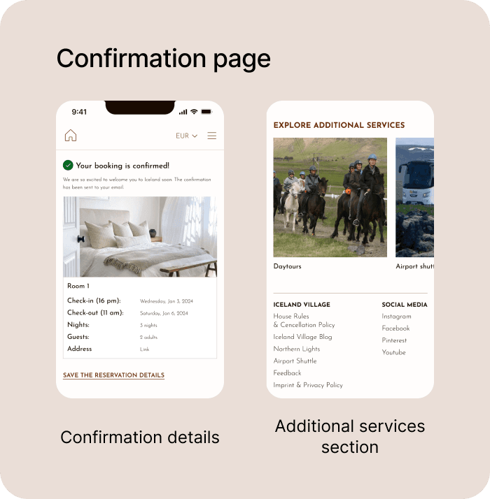
Confirmation
Information about booking confirmation has been added.
Content cards have been implemented for familiarisation with additional services.
Learnings
Working on this task allowed me to see how the adopted decisions affect the end result. The changes were quite extensive, and it's fair to note the cumulative effect on the main metric.
In the approach to solving the task, research was an important stage. Given the limited time, I chose desk research methods. Next time, I want to add user methods (in-depth interviews, unmoderated usability testing) to confirm/refute the formulated hypotheses and gather additional information about the difficulties the product audience faces.
In the future, I plan to insist on an iterative approach to implementing changes instead of one big launch. This will allow more accurate tracking of the impact of new features on metrics.
And, of course, it's important to prioritize the prepared hypotheses and discuss their implementation order. This will better manage expectations and also distribute the load in the team.
