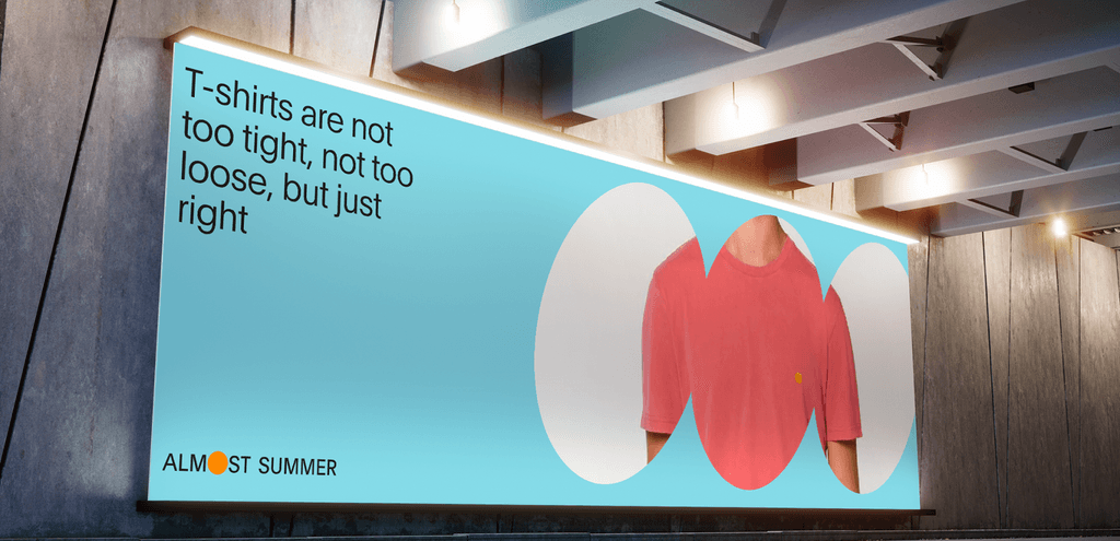
Almost summer is an independent clothing brand from Amsterdam. Even the brand's clothes are quite cool, bold and unique, it's hard to say the same thing about their website.
That's why I decided to take my own perspective on the visual. Within redesign I wanted to highlight their famous unisex t-shirts, which symbolize blank canvas to make up anything and everything.
Task
Make a redesign of Almost summer website in order to improve:
visual hierarchy.
make a unique and memorable design as brands clothes.
implement familiar practices for e-com website experience.
Important notice
Currently I'm working on a description for this case. It'll be here soon) Meanwhile, you can check the full case on behance platform.
