Johnson&Johnson is a multinational corporation that manufactures consumer goods, medical technologies and pharmaceuticals.
The project was released prior to its official rebranding and subsequent website redesign.
Reasons and desired result
Why did I decide to redesign this website?
The site featured a complex side navigation bar and a cluttered footer, causing user confusion.
Information overload obscured the company's business focus.
As a result of the redesign, I wanted to get a website:
Where users could quickly grasp the organisation's activities from the homepage.
With structured information and a clear hierarchy.
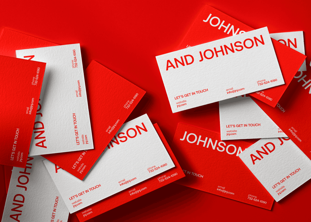
That emphasised brand colors.
Incorporating interactive solutions to engage users with the brand.
Explain: new design
Color
The company's red accent color, symbolizing health, energy, strength, and life, was integrated into navigation elements, icons, buttons, and typography for consistency and brand recognition.
Typography
Aeonik font was chosen for its readability and rounded appearance, enhancing brand credibility and content legibility, particularly in uppercase format.
Grid
A simple four-column grid structure was employed to accommodate interactive elements and maintain visual harmony. Sections with alternative grid layouts were strategically placed to draw attention and add dynamism.
Home page
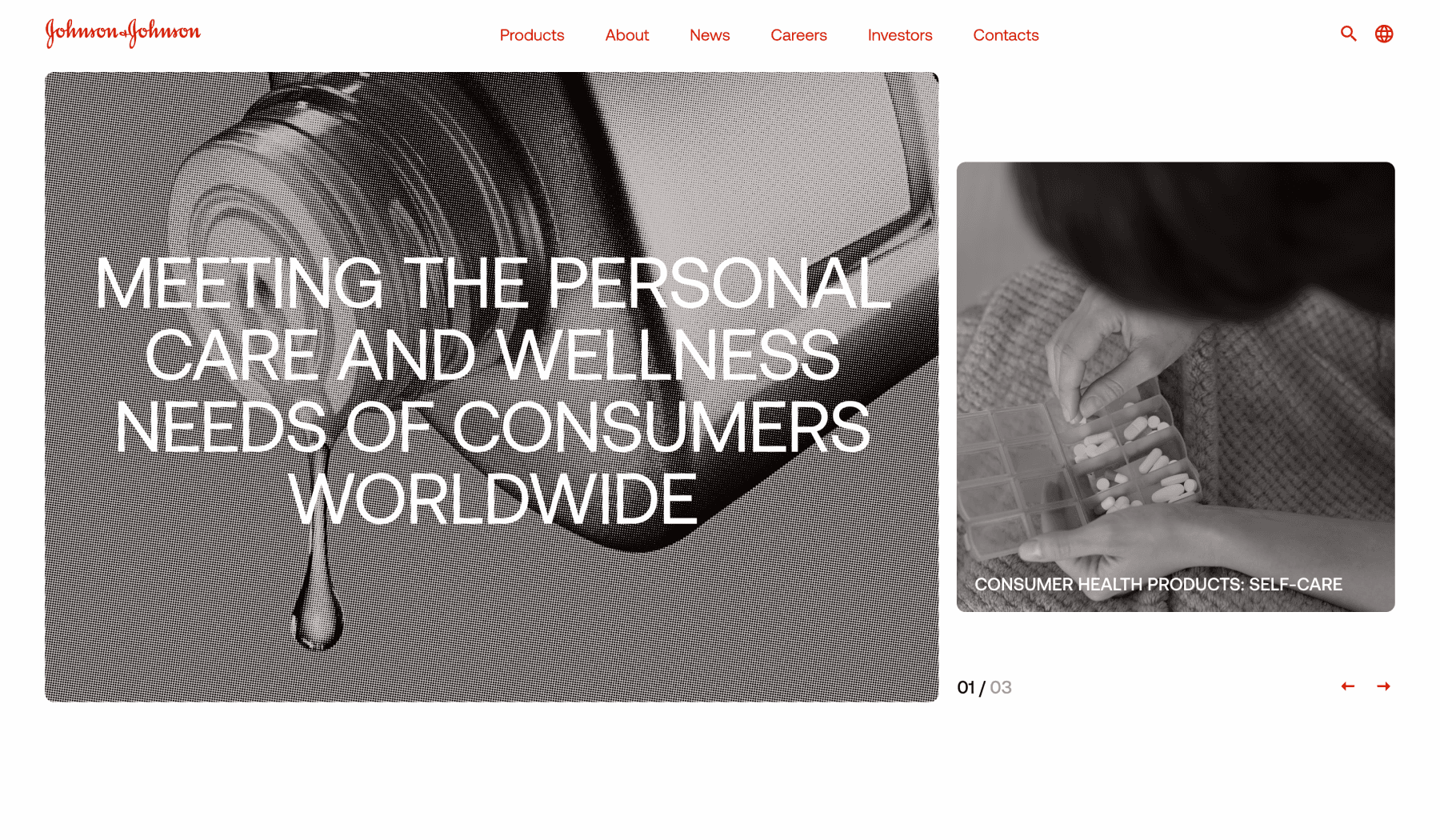
To align with user expectations (per Jacob Nielsen's Law), the navigation bar was relocated to the top of the page. Additionally, the homepage now prominently showcases the company name and slogan, providing a clear direction for visitors.
Unlike the previous version, which resembled a news gallery, the cover now features a widget displaying the top three news items. This decision was made to cater to the interests of investors, one of the key audience segment for Johnson & Johnson.
Home page
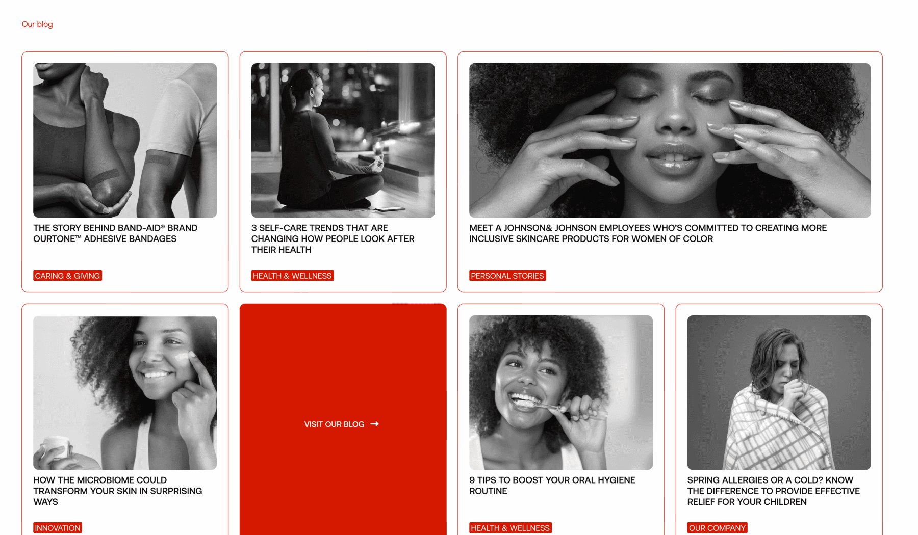
Instead of the previous layout consisting of four article blocks, the homepage now presents information about the company in the form of facts to enhance user trust. This includes sections detailing the company's various segments of activity and a comprehensive product list. The attention then shifts to the company logo, followed by its credo and commitments to consumers, before concluding with the news section.
As a result, the homepage serves as a crucial structural element, enabling users to gain insight into the company's activities and easily navigate to other sections of the site with a single click.
Consumer healthcare page
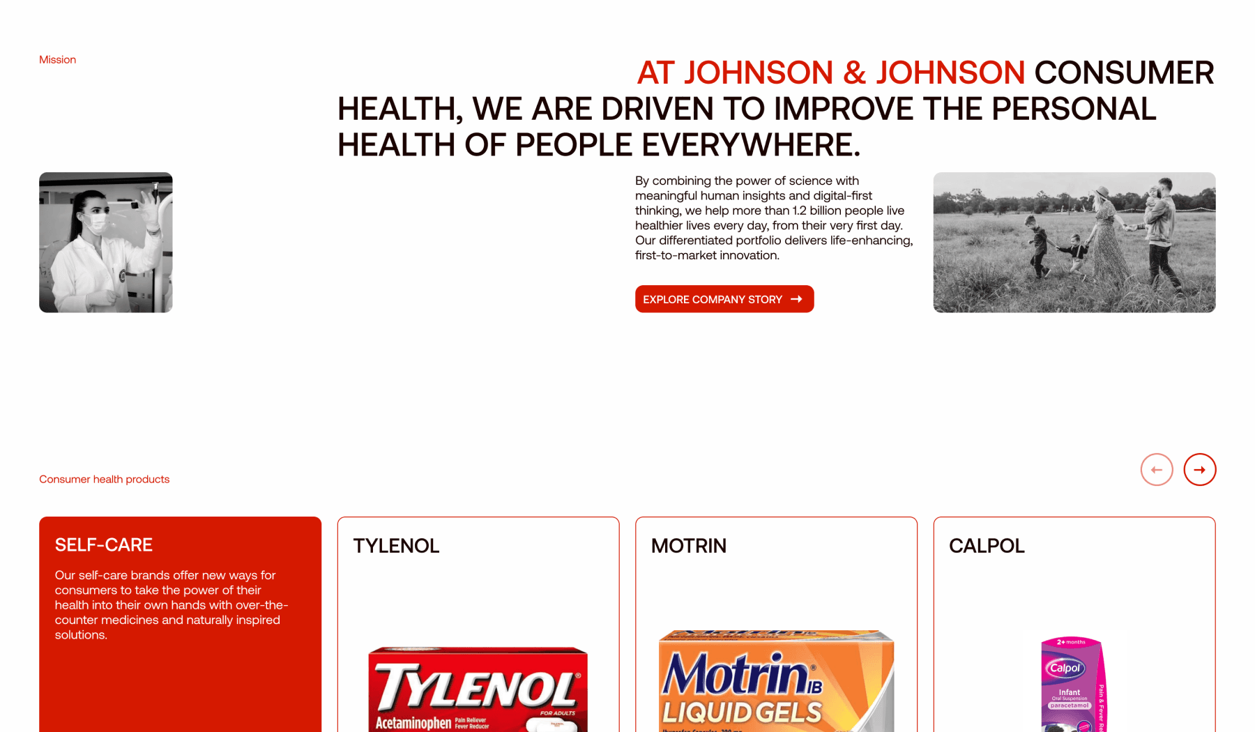
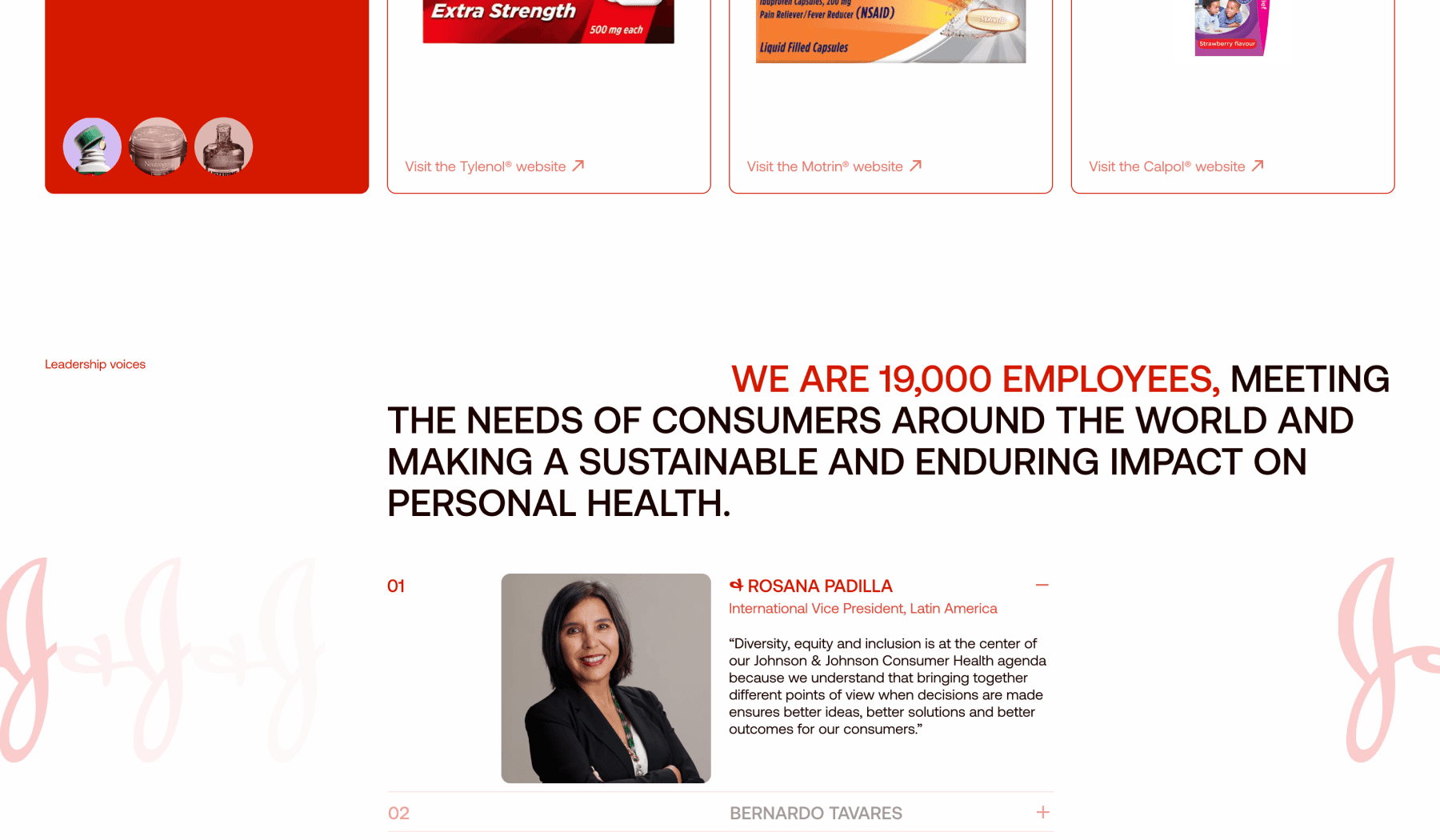
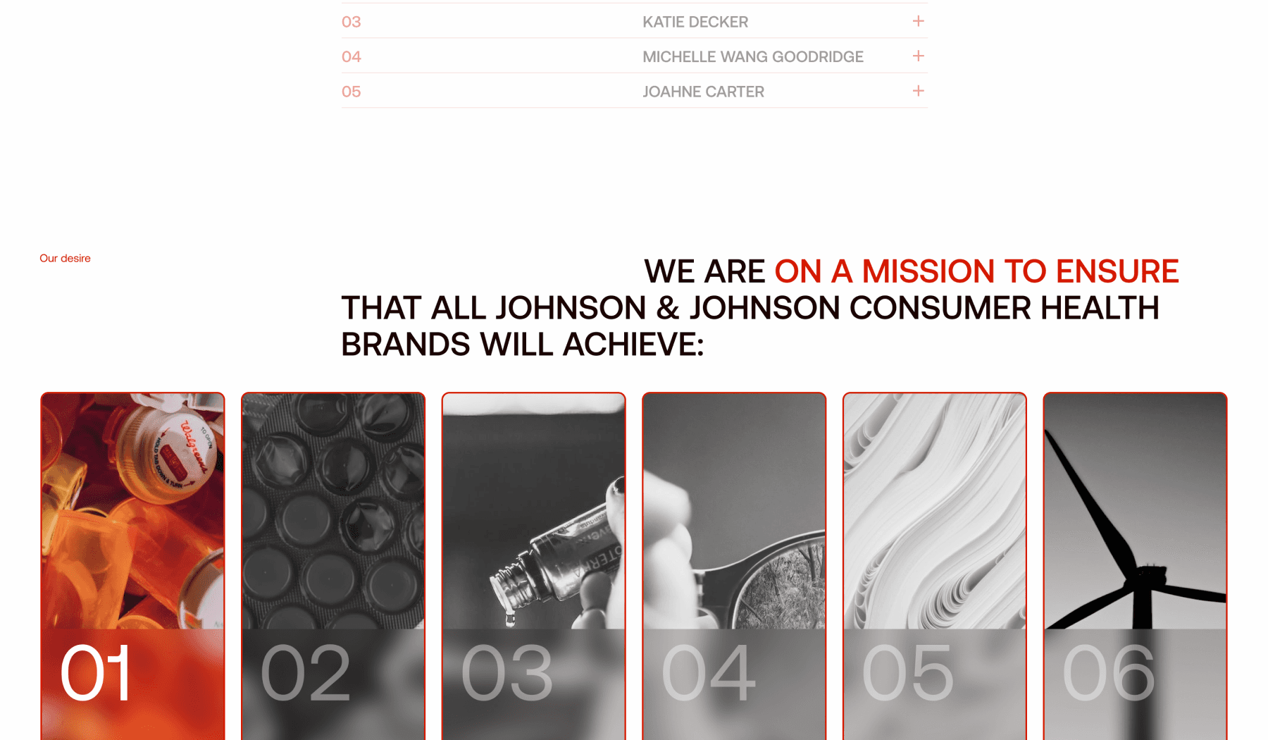
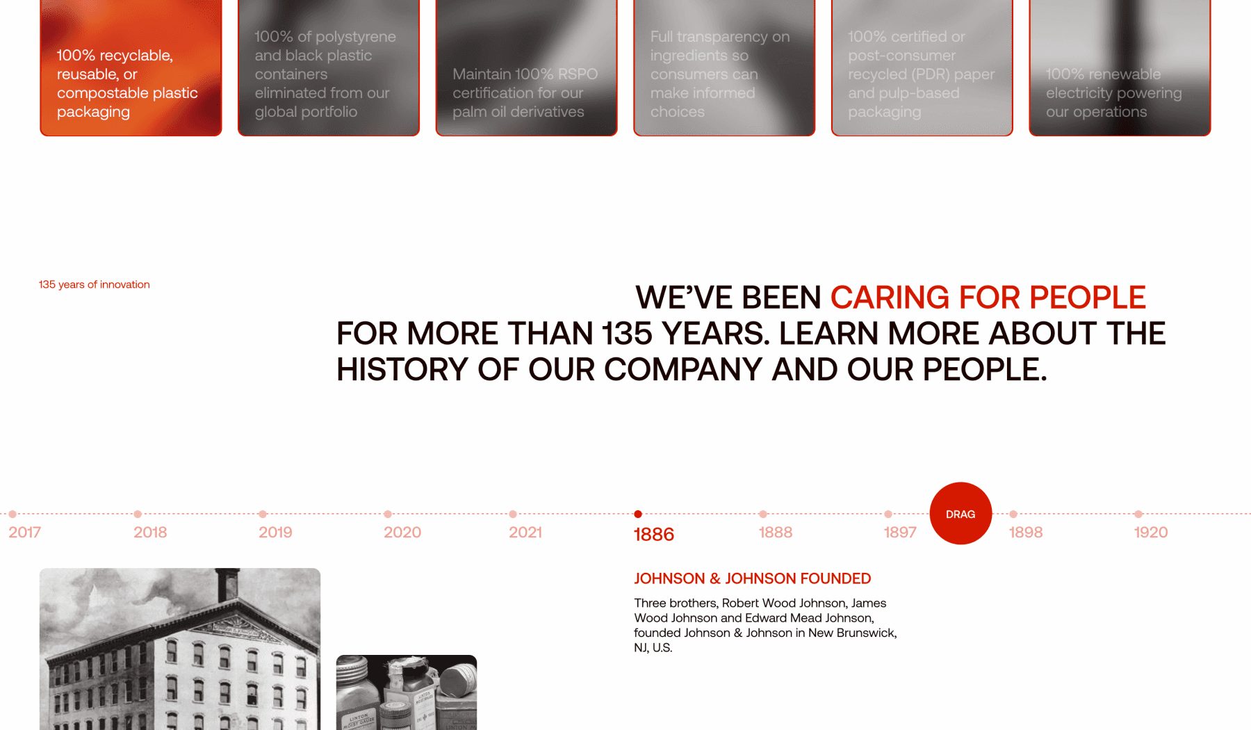
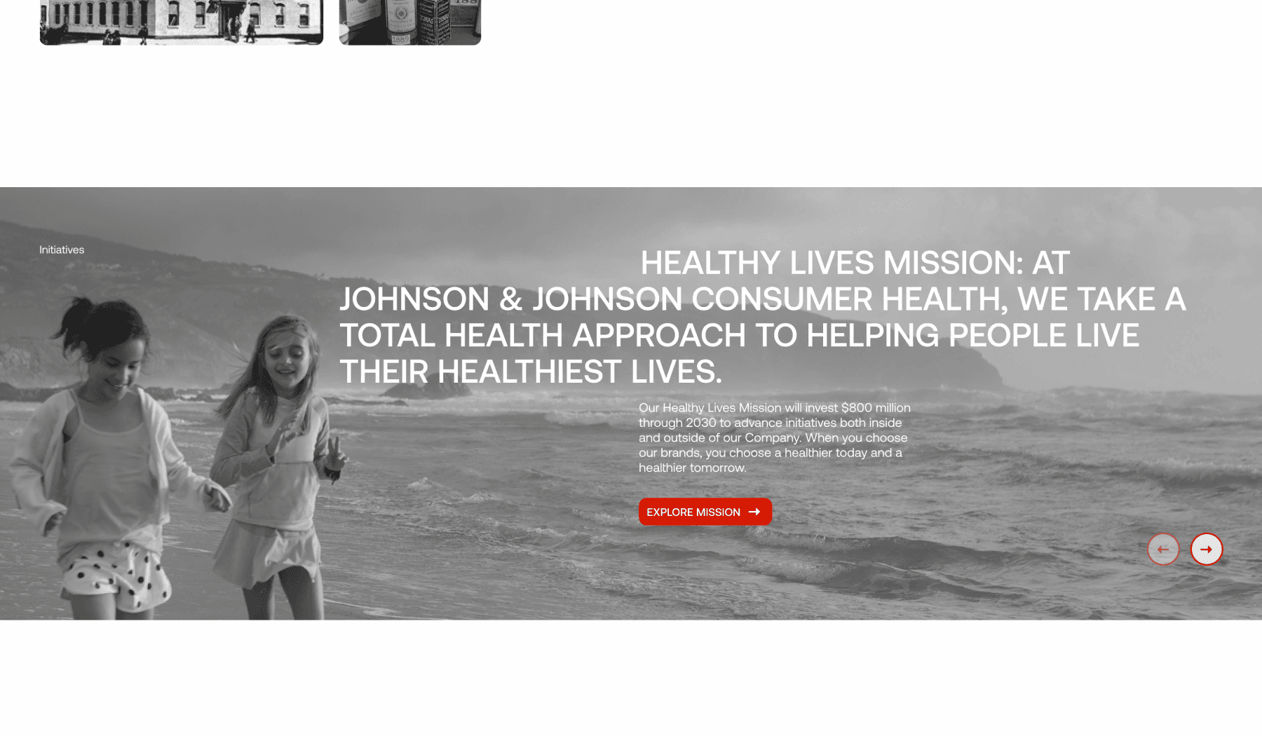
The Consumer Healthcare section was redesigned to showcase the division's mission, products, and company initiatives. A concise mission statement and product cards were added to provide users with a clear overview.
Information was organised into digestible sections to prevent cognitive overload, following Miller's Law. Visuals were incorporated to enhance the presentation of product information, improving user comprehension. A dedicated section highlighting the company's mission and initiatives was included to underscore its commitment to consumers. The timeline showcasing the company's history was elevated for user engagement.
The redesign extended to pages covering business directions, the about page, and the contact page.
The full case
The full case you can find on behance platform along with a video animation I made in Adobe After Effects
